
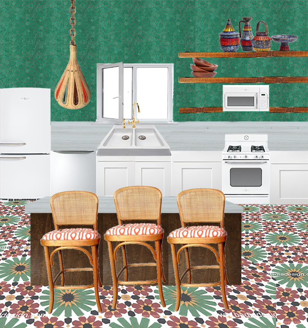
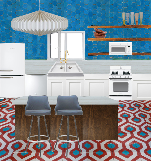

We got the keys to our new home just last week, but because we hope to get the kitchen remodeled before we move in July 1st we hit the ground running. First stop was to Badia Design to pick out Moroccan tile. I’ve been dreaming of putting cement tiles in my kitchen forever and plan on basing the rest of the design off of the tiles so that was a first stop. We narrowed it down to four designs (thanks to those of you who weighed in on this post.) And now we’ve narrowed it down to three. To help better choose the tile, I created a few sketches of the design we (more or less) want in the kitchen. Then I’ve accessorized with different design elements to better get a sense of what each kitchen would look like. So which is your favorite? I’m seriously torn over here! I’d love to hear what you think!
Lamps, Stools and dishware from my favorites on Chairish.
Definitely the first one!
Love the first one!
First one!
First one! I love the colors and I think this one also gives you the most flexibility, especially with open shelving, on what you can display and still have it look cohesive. The other two seem more restrained to me. They’re great colors, but I think just less versatile to work with.
Really love option number one!!!!
that’s a toughy! My first instinct was # one but I’m actually leaning toward # two the more I think about it. I’m wondering if the slightly larger print elements might make the room appear a bit bigger? I’m also just a sucker for the turq and red combination :-)
First one!
Number three does it for me!!
I LOVE the blue tile with the gold outline in the second one! Definitely the second one!
I love the first one but the pendant in the second. Can you mix and match? :)
Yes I can!! (and WILL!) haha!
Hi Justina,
All of them have appeal, so take some pressure off yourself. I like the blue walls best. Most impact there, I think. The floors are visually interesting.
Definitely the green wall but I’m torn between 1 and 3. For me, I’d pick 3 (I love color but I also like things a little more minimal) but I think 1 might be perfect for the Junglalow!!!
Number 3 is my favorite, but I also love number 1! Good luck choosing. What ever you do will be great!
Number three! Wonderful foundation with flexibility to change and grow over time.
Top one is my fav!!
The first one!!
#1 strikes me as more boho, #2 as more retro/mid-century, and #3 as more (relatively) minimal and feminine.
Personally, #1 wins it for me with #3 as the runner-up. #2 is also lovely, but I’m a GREEN kinda gal!
I love number 3 for the color, but also because it gives you options for different wall colors in the future, I see it as a neutral
one or two. Just don’t like the peachy floor of three.
now that I see it in a mood board, I think I m in love with the first one.
First one. Strikes me as more “you”. Somehow. Also, I really love the floor tile in first one. More dynamics, more nature..less geometry.Speaking of colors, and just of colors-I love first and second options equally.
PS I have to add, I admire your ability to ask for specific advice(even though I know it can be really helpful to sort out things, even on the level of carefully listening to yourself while listening to others). Maybe it’s the other side of being confident?..I dunno. Will think about it some more))
hmmm…thanks for this comment. I do think I’ve gotten pretty good at balancing my own voice with those of others. Maybe I can thank my psychologist mother and father for this :P
ahhhhh!!! this is so exciting, I love tile! I think #1 is the most jungalicious, but I love #3 the most. It’s a little bit calmer and I’m sure you will want to fill it with lots of crazy patterns on top of that anyway right? So it might be better to start with a calmer base. Good luck!
Yes I totally agree with you! That’s exactly why I’m torn.
I love the first!
Number one – love it with the green!
I love the first one! So bold and beautiful!
if you’re anything like me, you like to change things up every now and then. I think the third option will let you do that. As much as I like the strong patterns in the other ones I think they will restrict how much you can change it up.
#3 all the way
X
The green wall and the pendant from number 1 for sure!
# 3 for sure!!
I found your site a month ago and I’m in love! My favorite is number one with the fixture from number 3.
#3
Number 3
The first one is so warm and inviting! I love the contrast of the green and earth tones.
1 or 3, for sure. I don’t like the accessories in 2 very much, and the others seem like they’ll go with more.
The first one is so warm and inviting- that tile is BEautiful- I love all the other elements in number one, too- definitely my favorite!
Definitely the first one says jungalow! Love the colors and pattern.
Number 1!!!! So good! Congrats on your new Jungalow xx
Absolutely without a doubt its gotta be #1!! Love patterned tiles, too my friend. Been stuck trying to decide on some for about 6 months now! Also I love that youre incorporating open shelves and those FAB retro style GE appliances! Cant wait to see this!! Good luck with your decision.
definitely number one; it feels warm and cosy and still fresh. number 2 is nice too, but I wouldn’t like to sit in a blue kitchen on a grey and rainy day. blue and food have a hard time getting to me…
Number 3 is giving me chills! I totally get the inspiration from your vine-on-blush-wall moment ;)
All of them would be great, but the green walls/blush tiles/wood light fixture combination is just perfect.
I love #3. You could go a million different ways with it and choice #3 will be most appealing for resale. #1 seems too obvious and I don’t care for #2.
#3 has more long term potential when you want to change other things in the future AND resale value.
#3 is the winner for me! Great color and texture, and with the more subtle floor, more of an opportunity to switch out lots of different accessories based on mood :)
On Instagram, I was totally into #1, but here, with it laid out, I think that I like #3 a bit more. I think the more neutral floor pattern works with more patterned finishes.
my hubby agrees with you :P
I think #3 looks dope, plus it’s easier to change out accessories to get more maximalist or minimalist.
I love #1. I appreciate the more neutralness of #3, but #1 is gorgeous and bold and I love the wicker elements in the chairs and how plants will look with the green flowers of the tile. It isn’t as neutral, as #3 of course, but a different color wall, different window treatments and different cushion fabric could still really change up the look even with those bold tiles. Thanks for asking for input! :)
and thanks for sharing your input! I love reading it all and soaking it all up!
ONE!
I think it is obvious that you truly like #1 the best because all the other things you chose for that picture (shelf things, light, stools) look like you;) Enough with this #3 is easier to change up later. That’s how people end up with boring houses… hence my brown couches!
haha!! I’m totally reading your comment to my hubby :P
The first one! Love the green, love the more elaborate tile on the floor, LOOOVE the lamp!!
PopPop says no. 1. the boho maximalist. he likes 3, too. I also like the flowered floor tiles, and wondered about yellow on the backsplash…i also liked the argument of those who voted for 3, that a) its more flexible over time, and b) you can maximalize the rest of the kitchen to go…i also wondered about the peach floor with the blue backsplash tiles..he he. y’all go for it. also impressed by your ability to ask for feedback, and keep your eye.
Ok I know I loved combo #1 on instagram but seeing it here.. Im not sure that this green is bright enough? Don’t mean to complicate choices with more diversity- BUT – love those chinks of color you painted on the walls in the current jungalow – possible to use this idea in the kitchen too? White tiles background with areas of color triangles or circles, which ever shape you prefer, of bright color behind shelving? Love that sacred geometry design tile in the terra-cotta pink and white. Would make a great bathroom floor tile, in fact the blush pink white and green theme would be perfect to create a calming, intimate space for a bathroom.
Such a cool idea!! I never thought to use tile to create those shapes and I agree that would look very neat!
numero UNO!!! Its so good. those green tiles. they are YOU! Normally I love blue in a kitchen but this green is spectacular.
Less is more. Definitely #3!!!
I say if you’re going to go for, go for it! They’re all beautiful but the first one unmistakably reads Moroccan tile – and is amazing. Number 1 for sure! xoxo
What program did you use to lay out your options?
eazlwfgmpweeusixlbpgke