This post is brought to you by Curate Snacks.
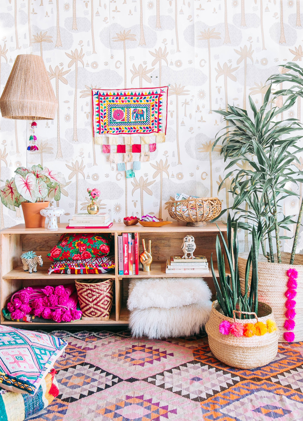
If there is one question I get asked over and over about boho decor, it’s how I make so many eclectic, unexpected elements work together to create something cohesive and visually compelling. And my answer is always the same–it’s all about color. You can mix patterns to your heart’s content, layer in textiles from all around the globe and so long as you work within a defined color palette, your space will come out looking cohesive. To demonstrate how it all works, we’ve teamed up with our partners, nommy nom nom Curate Snacks, and used the brilliant combinations in two of their snack bars as a jumping off place to decorate two spaces in unexpected color combos.
Our kindred color lover and homegirl Joy is doing the same thing over on her blog, Oh Joy! today and she’ll be sharing her own inspiration and styling as she works with two other color combos in her own space so be sure to check that out.
The first unexpected color combo we’ll explore is crimson and cream (inspired by the Sweet & Tart bar). Here is our mood board:
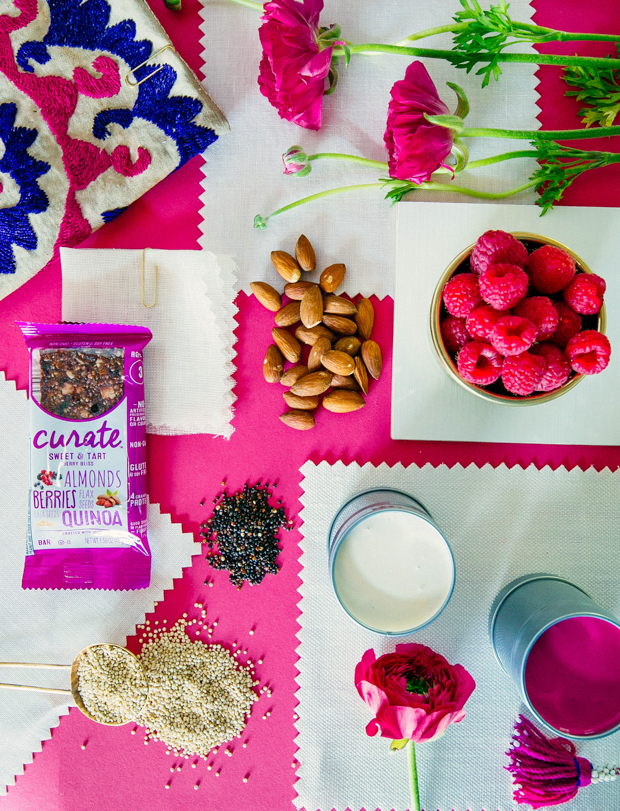
This color palette is inspired by the neutral tones in almonds and quinoa, and the pops of intense color in raspberries and currants. I can see it working well in a dining room (colors in the red family are known to enhance metabolism). I also think it’s a great combo for a kids’ room.
Crimson is an intense color. To make crimson (or other hot, bright colors) work in your space, follow these tips:
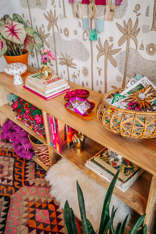
#1. Go easy. For colors that pack a color punch, like crimson, you’ll want to use it in small doses. Instead of painting a room crimson, try bringing in the royal hue through accessories and accents.
#2: Pair brights and neutrals. Pair hot colors like crimson with a neutral color that plays a supporting role and lets the hot colors have the big solo.
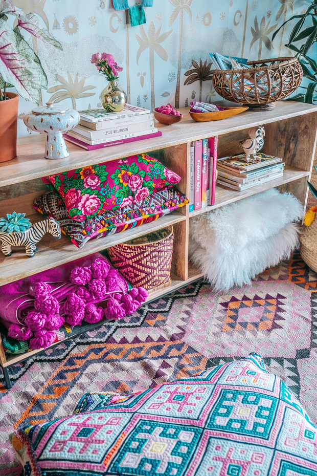
#3. Use Textiles. Bring serious colors like crimson in through textiles. Textiles seem to soak up light instead of reflecting it, so I find that a room can handle a lot of color if it comes in through soft goods like textiles.
#4. Be Flexible. When you adhere to a specific color palette, the palette should act as a guideline, but don’t feel like everything has to match perfectly. Spaces feel more harmonious when lots of colors that blend well together are on display. The overall feel of the space should reflect the color palette you’re going for, but that doesn’t mean every color used needs to be within the prescribed color palette. (You’ll notice lots of pops of orange in our space, for example).
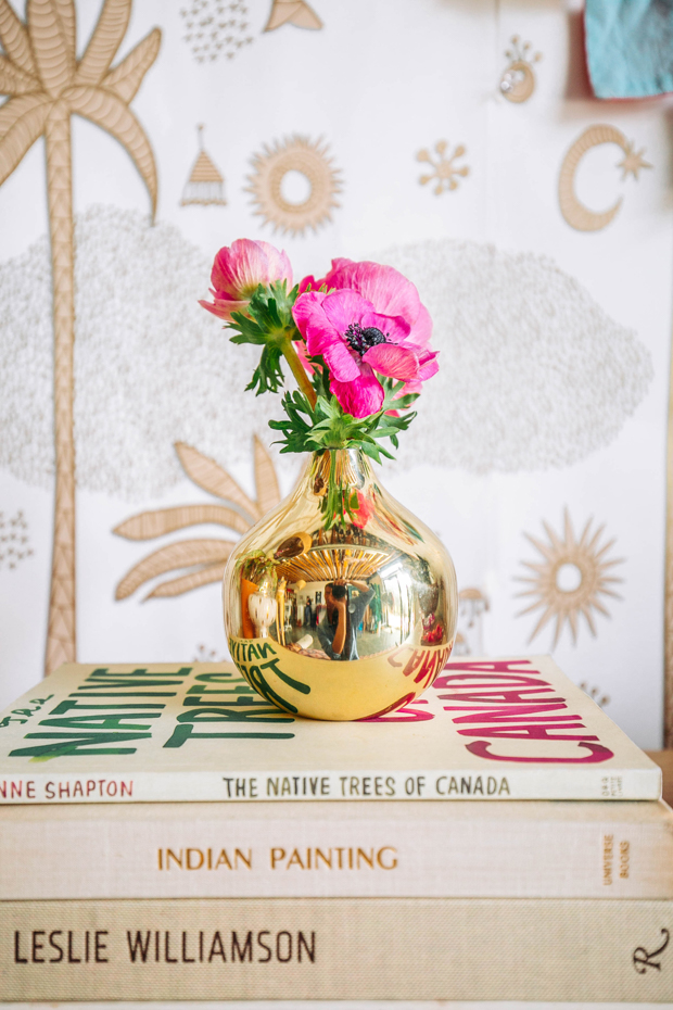
#5. Add metallic accents. Metallic reads as a neutral and can work in any color palette to make a space feel a bit more chic and special.
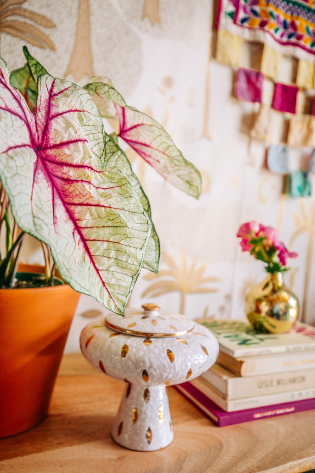
#6: Use plants Bring in plants in unexpected colors, like this beautiful white queen caladium, to really make your color palette sing.
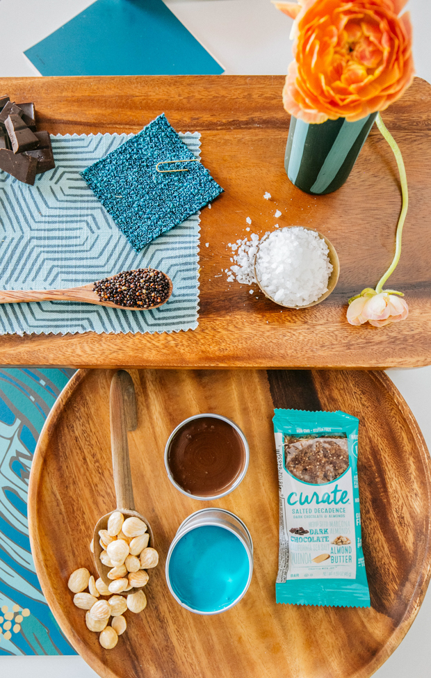
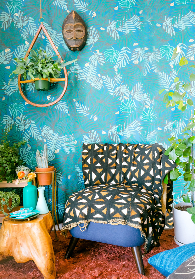
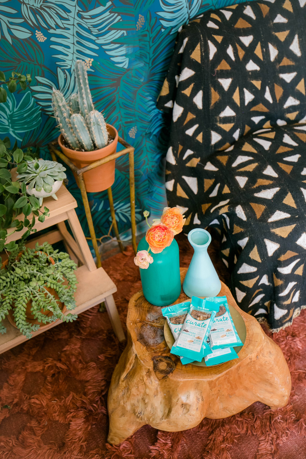
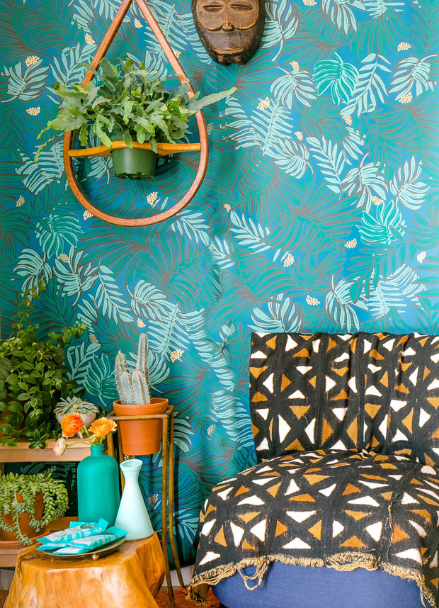
Now we’re gonna cool things down a bit with this next combo: turquoise and chocolate brown (inspired by the Salted Decadence bar). This palette is earthy and beachy and reminds me of the cool blues of the salty CA seas, and the warm earth of central valley almond groves. This palette lends itself to everything from a coastal chic dining room, to a calm and collected bedroom, or a decadent den.
Here are some tips:
#7. Use analogous colors. Analogous colors (AKA colors that sit next to each other on the color wheel) work well together to create a harmonious vibe — so when picking turquoise colors to use, for example, use different shades of the same color to make the room feel even more dynamic.
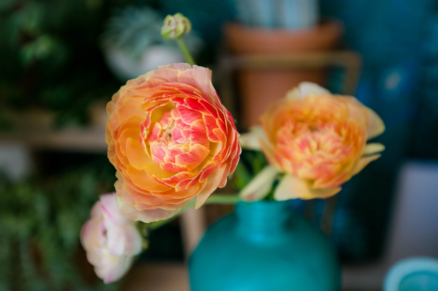
#8. Use flowers as accents: Bringing flowers into a room will always provide a breath of fresh air and a pretty pop of color, but you can also use flowers to help bring out accent colors in the design. These orange/gold ranunculus make all the warm earth-tones in our vignette feel rich.
#9. Play Nice: When picking colorful patterns to use in a space, pick patterns that don’t compete. The two main patterns featured here, the leaf-print on the wallpaper and the graphic print on the mudcloth on the chair play nicely together because they contrast enough from one another not to compete.
#10. Inspiration for color combos can truly come from anywhere. One great way to pick an inspiring new palette is to go around your home and group items together by color. See what items work well together and create new, unexpected pairings and redecorate based on how the colors work together and contrast with one another.
Also, go try Curate snacks, not because they’ll inspire you next room design necessarily, but because they are seriously delish. ;)
*Photography by Dabito for The Jungalow
*This post was created in partnership with Curate, all opinions are my own.

Looks amazing! Love your use of color and texture!
Beautiful color choices! Where did the wall planter in the turquoise room come from!
Hi! Thanks so much! The wall planter was found on etsy using “Bentwood plant hanger” search term. Its Vintage.
Thanks for the tips! Where is the plant hanger from?
Hi! Thanks so much! The wall planter was found on etsy using “Bentwood plant hanger” search term. Its Vintage.
This three-color flower looks perfectly this room
I am in love with this look! Dying to know where the rug is from??
Thanks so much! The rug is from Kaya Kilims — it’s vintage but she always has a great selection. (http://store.kayakilims.com/)
Great site, thanks!
and yummy post as well
Love, love, love everything you do!! These two spaces are no exception. Inspiration from snack bars? Amazing! The wallpaper in the turquoise space is so pretty…is it available?
hi Kylee! Thanks for your kind words. The wallpaper in from my collection for Hygge and West, available here: http://www.hyggeandwest.com/collections/wallpaper/products/aja-teal
Great post as always, Justina! I’ve often advised people to look at commercial graphics and product packaging as color inspiration for decor but I’ve never seen it realized so well.
Thanks so much!!
Beautiful post! Where is the blue wallpaper from?
hi Monica! The wallpaper in from my collection for Hygge and West, available here: http://www.hyggeandwest.com/collections/wallpaper/products/aja-teal
Love the wall hanging in the Crimson room! Where’s it from?!
Hi Kristi! — It’s a vintage ‘toran’ from India — try etsy or ebay and searh “vintage toran elephant”I’ve seen similar ones come up before. Good luck!!
ah Justina, I think I love you. Best sponsored post i’ve ever seen! I want to buy everything! Write a resource/shopping list? did i mention you’re the best?
Great idea to add a resource/shopping list! I will add one ASAP. Thanks so much for your kind words!! xx ~j
Hi! Where can I find the resource/shopping list? I want everything!
Beautiful post Justina ! Love these pop of colors. The small elephant wall hanging seems a perfect art piece for the wall . So inspiring!
I love the Pom poms on the planters, did you add those too?!
Wonderful interior. May I ask about the bookshelves? Where did you bought them please?
Nice post Justina ! Love the colors of pops. The small elephant wall hanging look4 a perfect art piece on the wall . So inspiring!
Full Moon in Paris 1984 In French Full Movie 720p & 1080p Download Full Moon in Paris 1984 Full Movie