The bathroom remodel #2 is underway! I got back from NYC last night to find that the whole bathroom had been demo’d and all the plumbing done! Wow! (If you need to catch up on this project, you can read about the inspo behind the design on this post.) Today, the framing is going in for the SIX FOOT TALL window above the bathtub. OMG. Things are moving very quickly because after the last bathroom remodel took so long, we ordered everything in advance this time — from the Fireclay tile to all the Kohler fixtures and hardware and that 6 ft. window — it’s all in our garage. I highly recommend remodeling things this way so that the labor time goes down quite a bit. I’m guessing we will be done in 2-3 weeks whereas last time, it took several months.
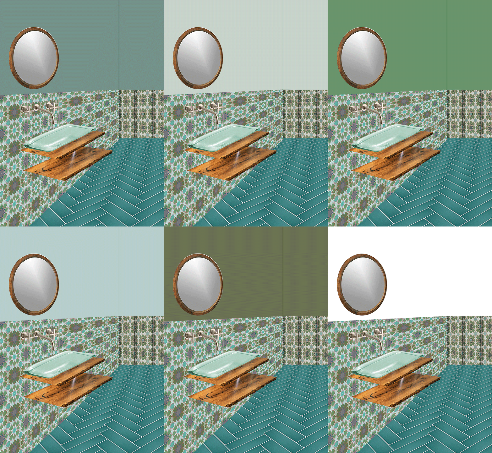
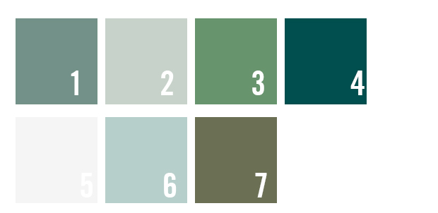
Since things are moving so fast we are having to make all design decisions VERY quickly. Today, I’m looking at paint colors for the walls above the tile. Below are the colors we’re thinking about. I wanna use milk paint so that it has hammam vibes with a kind of uneven paint look.
Which color do you like?


I love #4, that deep moody teal is a dream. Can’t wait to see the final product!
I’m drawn to #1 — feels balanced wtb lots of room to jungle-ize.
I’d go with #3 or 4-rich and lush. I’m excited to see the finished room. Thanks for the behind the scenes peek.
I’m feeling 1, 6, or 7. 7 might be fun if you’ll get a lot of light in there from that window. I can’t wait to see more progress pictures! We’re a couple of years out from re-doing at least one of our bathrooms, so I’m enjoying some Fireclay tile fantasies through your posts.
1 & 4
I agree. #1 appears fluent and calming, #4 makes a beautiful impact that’s stunning. It looks spacious enough to work either way. For a smaller bathroom, I’d definitely say #1, but it appears large enough for something a little bolder. I’m new to this amazing site, but love the images!
1
3 or 4 :-)
Not 2, 5, 6 or 7.
Maybe 1
I’m on another page from everyone else. I say 2 or 6 so it won’t complete with the lovely tiles.
Loving 4! I’ve been really into that color lately and I feel like it would fit your house as a whole
3 or 7. Both feel a little unexpected to me. That said, ALL the colors look luscious. You can’t go wrong.
2 or 6, so it won’t compete with wall and floor tiles.
7 all the way!!
4 – I love that color!
#3!!!
#2 or #6, I prefer the lighter color choices to soften the intensity of the beautiful vivid tiles, and enhance the organic feeling. It will be gorgeous!
#2 and #6 are my faves. The soft, lighter tones with subtle green look great with the colorful tile and darker floor. It’s a great balance and still jungalicious.
#4 is beautiful!!
Tania
Love number 4, beautiful color!
Love number 4, beautiful color!!!!
The rest of the house is so deep + moody + saturated (in the best way!), so it’d be nice to get a light and bright break. With that, I vote #6 :)
B
#3! Green is the colour (yes, I’m Canadian) of the year, after all!
4 definitely! Xoxo from Paris
#1!
2 or 6 for sure. Even in the mockup the room looks bigger and lets your eye focus on the lovely tile.
4 or 6
#4 for sure, esp if you’re going to have so much natural light in the space.
2 or 6. They keep it airy and fresh and plants will really pop against the blue. But I’m sure whatever you pick will be fantastic. I’m loving your mood boards for this room! Did you see Target’s jungalicious Spring stuff? A lot of great blues and greens.
The share your really gives us excitement. Thanks for your sharing. If you feel tired at work or study try to participate in our games to bring the most exciting feeling. Thank you!
I love #7!
#1
I would be so overwhelmed by this decision! I wish you well.
#4 is really my favorite favorite, but I also like 5. :)
#2 would be my choice
I would choose #2!
#4 but #1 is nice too.
#4 or #6…. Totally loving the more blue colors.
Love the drama of #4 especially if you’ll get a peek of it from the room with the wallpaper, and as long as you have enough light from the window to put on makeup!
#4! Simply becaue THAT colour in milk paint will look stunning and have a textural uniqueness! :)
#4! moody and relaxing :)
1 or 4
White! Let the tiles shine…
#4!!!
4! Beautiful!
#7 I love the contrast
6 for sure!
Love number three.
Green is my happy color.
Well one of them! Haha.
2 or 6 to make the room look brighter, clean and open!
I am drawn to either 2 or 6, I love how it appears to continue the background color of the patterned wall tile, cannot wait to see the finished bathroom!
I love 2 or 6 and how they blend well with the design of the wallpaper or pattern shown. Have you chosen a color yet? I will go check out your newest post after this.
Force 10 from Navarone 1978 In English Full Movie 720p & 1080p Download Force 10 from Navarone 1978 Full Movie
Famosa 2020 In Italian Full Movie 720p & 1080p Download Famosa 2020 Full Movie
I think you should go for light colors for the bathroom