Picking paint colors is hard. No matter how many times I spread open that fan deck to choose a wall color, I still feel like it’s kind of a dice roll. There are so many variables involved: the changing natural light, the contrast to the other colors already in the space (including the floor, ceiling and furniture), and of course the artificial lighting. Looking at a small swatch of color on a screen, in a store, or even on the wall in the room that’s about to be painted, I find it very difficult to imagine what affect it will have once the color is on all four or five walls.
I’ve begun to think the only full-proof way of picking great colors is to have your go-to tried and true colors, that magically seem to work even though each space has it’s own unique properties that affect how the color looks.
Every few weeks we paint our studio photoshoot area (pictured above) a different color, and now we’re creating a go-to list of our favorite colors that seem to work well even with lots of different furniture choices, room styles and types and lighting conditions. There are some colors that look great with everything, you know? The above photo is of our photoshoot area in our studio after we had moved in, updated the space and painted everything white… Simply White by Benjamin Moore, to be precise.
All of the photos that follow were shot on that back wall.
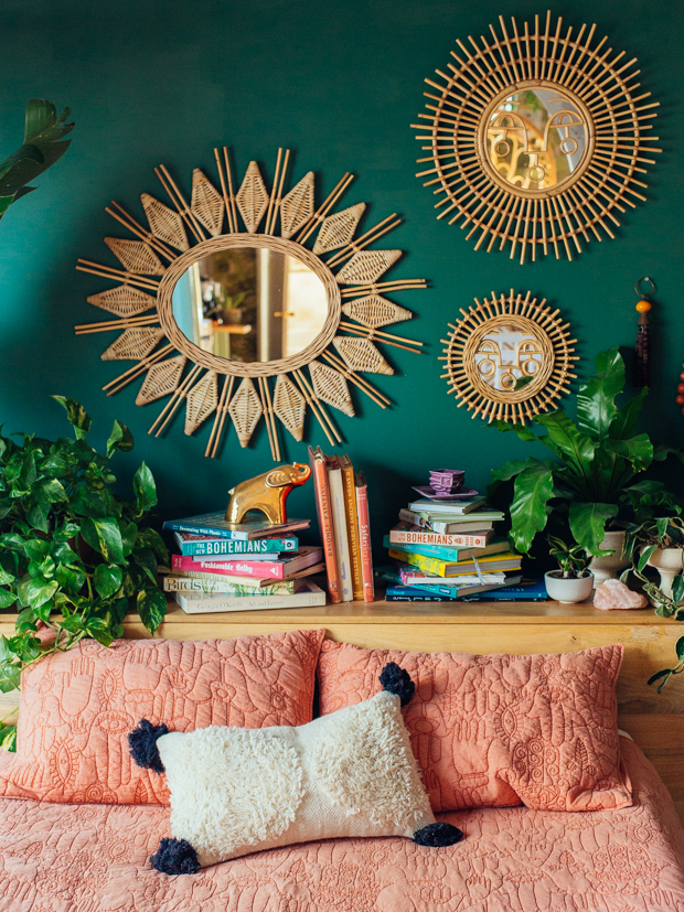
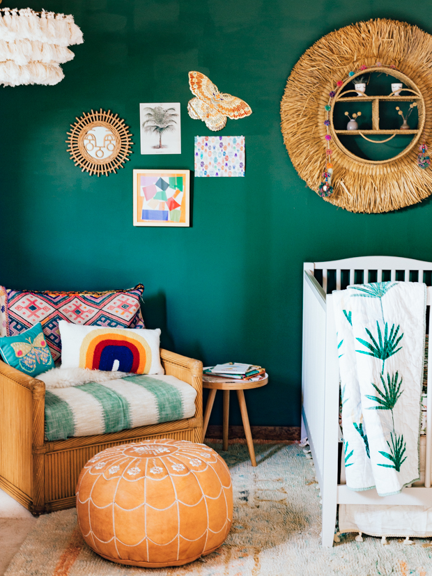
Above and below: Gothic Green by Benjamin Moore. I LOVED this color. It was very rich and soothing. I loved it for the adult bedroom with paired with our coral Hamsa quilt, and I loved it just as much for the below nursery shoot we did for our Pottery Barn Kids collection. The color was a bit dark, so I don’t think it would be my first choice for a room that I wanted to feel bright and cheery, but I love it for a bedroom or even a moodier living room.
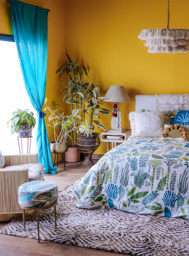
Bling Bling by Behr was a recent color we did as we were hankering for a little bit of sunshine during an unusually rainy and grey L.A. winter. On the swatch I felt it looked a little more mustard-y, but once we got it on the wall it was like a burst of golden sunshine. Really, really pretty, but also very specific. It was tough to pair it with a lot of stuff. I’m not sure I’d use it again any time soon as an all-over wall color, but I do think it would be killer on a front door or even to paint furniture with. I think it makes a really beautiful accent color.
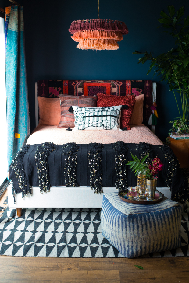
Hague Blue by Farrow and Ball. This color was INSANE. I absolutely loved it. Farrow and Ball paints are very, very pricey (about three times what a can of paint at the hardware store might cost you) but generally I do feel like getting the right color on the wall is worth the extra coinage. This color transformed so much as the natural light in the space changed. Sometimes it looked more navy, sometimes it had more green in it (like a deep sea green) other times it looked more grey. I love this color for a bedroom or a study.
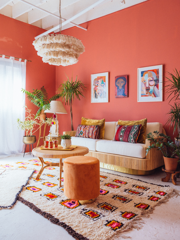
Above and below: Persimmon 2088-40 by Benjamin Moore. When this color first went up I found it to be very controversial and I did not like it (at all!!!). It was more orange than I thought it was going to be — and somehow in the camera lens it seemed way brighter and darker than it looked in person. But once we shot the above room setting I knew I was WRONG. In fact, this color kept on growing on me and we ended up shooting on it a ton and making some of my favorite rooms we shot last year. Like the Hague Blue paint color, Persimmon is a chameleon changing quite dramatically throughout the day, but it’s a color that is simultaneously invigorating and soothing — and those are my favorite colors to use in places where people gather, like dining rooms and living rooms.
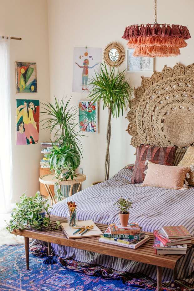
Navajo White by Benjamin Moore is a really pretty off-white that remains bright without looking too yellow or too grey. Despite that I feel that the name of the color needs an immediate update, the color itself is a very inviting, warm neutral.
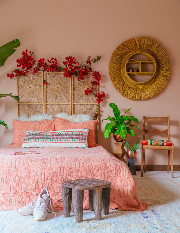
San Clemente Rose by Benjamin Moore was another favorite from last year. I felt like every color looked better once placed in front of this rosy neutral. I also found it to be very flattering next to skin tones, making it a good choice for bedrooms and bathrooms.
Do you have go-to paint colors that are tried and true? I’d love to hear some of your favorites! Who knows, maybe we’ll try them next in our studio wall!
Hope you’re week is off to a great start, friends!
xx
Justina




So much eye candy! I love your styling and I love that you have taken basically one wall and created so many different “rooms”. I have all the heart eyes for this post ??
thank you for this – it’s sooo good to hear picking paint colors is hard even for a pro. I’ve been trying to find the perfect off-white, unsuccesfully so far. Thanks for all the inspo!
What a well-timed post! I’m looking to redo some walls in white and had just gotten the idea to google what paint colors you use. Thanks for the insight! As for me, I’d paint the whole house in Benjamin Moore Skydive if given the chance. My master bathroom is in Raleigh Green with coral/orange accents and my bedroom is about to share that fate.
such a beautiful room to live .. amazing .. i was looking for custom cushions cover but i found here: https://www.coverissimo.net/zippered-cushion-covers/
It’s like living in a Rainbow. Thank you for introducing such a concept.
This is such a fantastic resource because you save all of us a lot of time and money by sharing and showing a range of colors that work for a range of rooms/uses. All stunningly gorgeous to boot! Thank you. That Hague Blue is tempting me for one wall in my bathroom now.
The content of the post is very nice and interesting. I like the posts from you.
color selection is always a confusing task for everybody.The way you deal with that is quiet interesting
this is really beautiful the third one must say loved them.
It seems a little unlikely that’s Benjamin Moore Gothic Green (637). There is way, way too much blue in the wall color of the photograph. 637 is more of a medium-dark sage green. Not this jungle green in the image. Is there an intense color filter on the images that would make this happen?
I thought the same thing!! No way it’s the same green unless there was a major filter.
I’m dying to know where I can find a “headboard” like that in the last photo. Really enjoying your style!
You provided a lot of good information, it was good because it was so helpful to me
Can you share the sources of the rug in the living room with the Persimmon 2088-40 colored wall
Can you double check that that wall is Benjamin Moore Persimmon 2088-40. When I look it up on line its waaaay more pink and muted. I bought a sample and tried it on my wall its nowhere near as orange as what you have pictured here. I love this orangey coral you have here and am dying to recreate it. Any guidance would be helpful!! Maybe its not Benjamin Moore. I see other paint brands have a Persimmon color that is more orange.
Thank you in advance! I love everything you do and want to recreate this for my bedroom!
Cry, the Beloved Country 1995 In English Full Movie 720p & 1080p Download Cry, the Beloved Country 1995 Full Movie
This is one of the best sites i have found on the internet until now. Nice article keep going.
One room, seven paint colors. That’s the goal. You take a wall, you choose your color, and you get rid of all the other colors in the room. I know this is going to sound weird, but it’s not actually that hard to do. All you have to do is find what is your favorite color to buy best appealing paint, and then you’ll be able to change the color of your entire room with just one coat of paint. And if anyone tries to tell you that this won’t work, just tell them that I’ve been doing it for years!
I want a cozy and inviting atmosphere so warm earth tones like beige or terracotta might work well.
Lighter hues of blue or green are good contexto choices if you want to create a happy and upbeat atmosphere.
I really like how this room is decorated, which is very nice and cozy.
Great article. I’ve been checking this blog constantly and I’m impressed! Extremely useful information, especially the last part where wheel spinner made me process a lot of information. I have been looking for this information for a long time. thanks and good luck!